Streaming PLATFORM
UX/UI redesign of SoundCloud.
Project description
UX/UI concept redesign focused on simplifying music discovery and creating a more immersive listening experience. This project rethinks SoundCloud’s navigation, content hierarchy, and playback flow to reduce friction, highlight creators more clearly, and help users discover new music with less cognitive effort, while staying true to SoundCloud’s expressive, creator-first identity.
Problem
Problem
SoundCloud’s existing interface suffers from several critical usability issues that hinder both creators and listeners
SoundCloud’s existing interface suffers from several critical usability issues that hinder both creators and listeners
Cluttered layouts with poor visual hierarchy and inconsistent spacing
Weak accessibility support, especially for visually impaired users
Buried creator tools make essential features difficult for artists to discover
Ineffective music discovery compared to competitors like Spotify
Ambiguous navigation with unclear labels like “Home,” “Feed,” and “Library.”
Ineffective music discovery compared to competitors like Spotify
Ambiguous navigation with unclear labels like “Home,” “Feed,” and “Library.”
Separated listening and browsing experiences that disrupt user flow
Buried creator tools make essential features difficult for artists to discover
Separated listening and browsing experiences that disrupt user flow
Weak accessibility support, especially for visually impaired users
Cluttered layouts with poor visual hierarchy and inconsistent spacing
Ambiguous navigation with unclear labels like “Home,” “Feed,” and “Library.”
Cluttered layouts with poor visual hierarchy and inconsistent spacing
Weak accessibility support, especially for visually impaired users
Ineffective music discovery compared to competitors like Spotify
Separated listening and browsing experiences that disrupt user flow
Buried creator tools make essential features difficult for artists to discover
Ambiguous navigation with unclear labels like “Home,” “Feed,” and “Library.”
Weak accessibility support, especially for visually impaired users
Ineffective music discovery compared to competitors like Spotify
Separated listening and browsing experiences that disrupt user flow
These problems create friction for SoundCloud’s core users: independent artists trying to grow their audience and listeners seeking authentic music discovery.
These problems create friction for SoundCloud’s core users: independent artists trying to grow their audience and listeners seeking authentic music discovery.
Personas
Primary Persona: Independent Musicians
Age
24
Goals
• Grow audience
• Monetize streams
• Gain industry recognition
Needs
• Simple, streamlined upload process
• Tools to promote music
• Visibility on homepage and
trending charts
Profile
An independent musician using platforms for the unsigned to publish his music, gain visibility, and connect with audiences.
Pain Points
• Overwhelming Platform Complexity
• Lack of Discoverability & Algorithmic Bias
• Unclear or Unfair Revenue Models
• Ineffective Promotion Tools
Secondary Persona: Casual Listener
Age
20
Goals
• Explore new genres
• Find music that feels personal
• Have a smooth listening experience
Needs
• Easy-to-use search
• Personalized recommendations
• Distraction-free interface
Profile
A college student who is overwhelmed when the site suggests too much random content. They want it to feel like SoundCloud “gets their taste” without requiring endless searches.
Pain Points
• Overwhelming Recommendations
• Poor "Music Memory" Features
• Cluttered and Distracting Interface
Research & Insights
Research Methods
SWOT Analysis
User Persona Development
Competitive Analysis (Spotify, Apple Music, Bandcamp)
Task Analysis, User Flow Mapping, and Heuristic Evaluation
Key Insights
Discovery is visually overwhelming
Dense layouts and weak hierarchy make discovery harder for both listeners and creators.
Accessibility gaps limit creator participation
Low contrast, limited text scaling, and weak screen-reader support exclude visually impaired users.
The interface is difficult to scan quickly
Visual inconsistency increases cognitive load and slows decision-making.
Navigation and creator tools lack clarity
Confusing labels and hidden CTAs make it hard for users to find the right content or manage creator features.
Personas
Primary Persona: Independent Musicians
Age
24
Profile
An independent musician using platforms for the unsigned to publish his music, gain visibility, and connect with audiences.
Goals
• Grow audience
• Monetize streams
• Gain industry recognition
Pain Points
• Overwhelming Platform Complexity
• Lack of Discoverability & Algorithmic Bias
• Unclear or Unfair Revenue Models
• Ineffective Promotion Tools
Needs
• Simple, streamlined upload process
• Tools to promote music
• Visibility on homepage and trending
charts
Secondary Persona: Casual Listener
Age
20
Profile
A college student who is overwhelmed when the site suggests too much random content. They want it to feel like SoundCloud “gets their taste” without requiring endless searches.
Goals
• Explore new genres
• Find music that feels personal
• Have a smooth listening experience
Pain Points
• Overwhelming Recommendations
• Poor "Music Memory" Features
• Cluttered and Distracting Interface
Needs
• Easy-to-use search
• Personalized recommendations
• Distraction-free interface
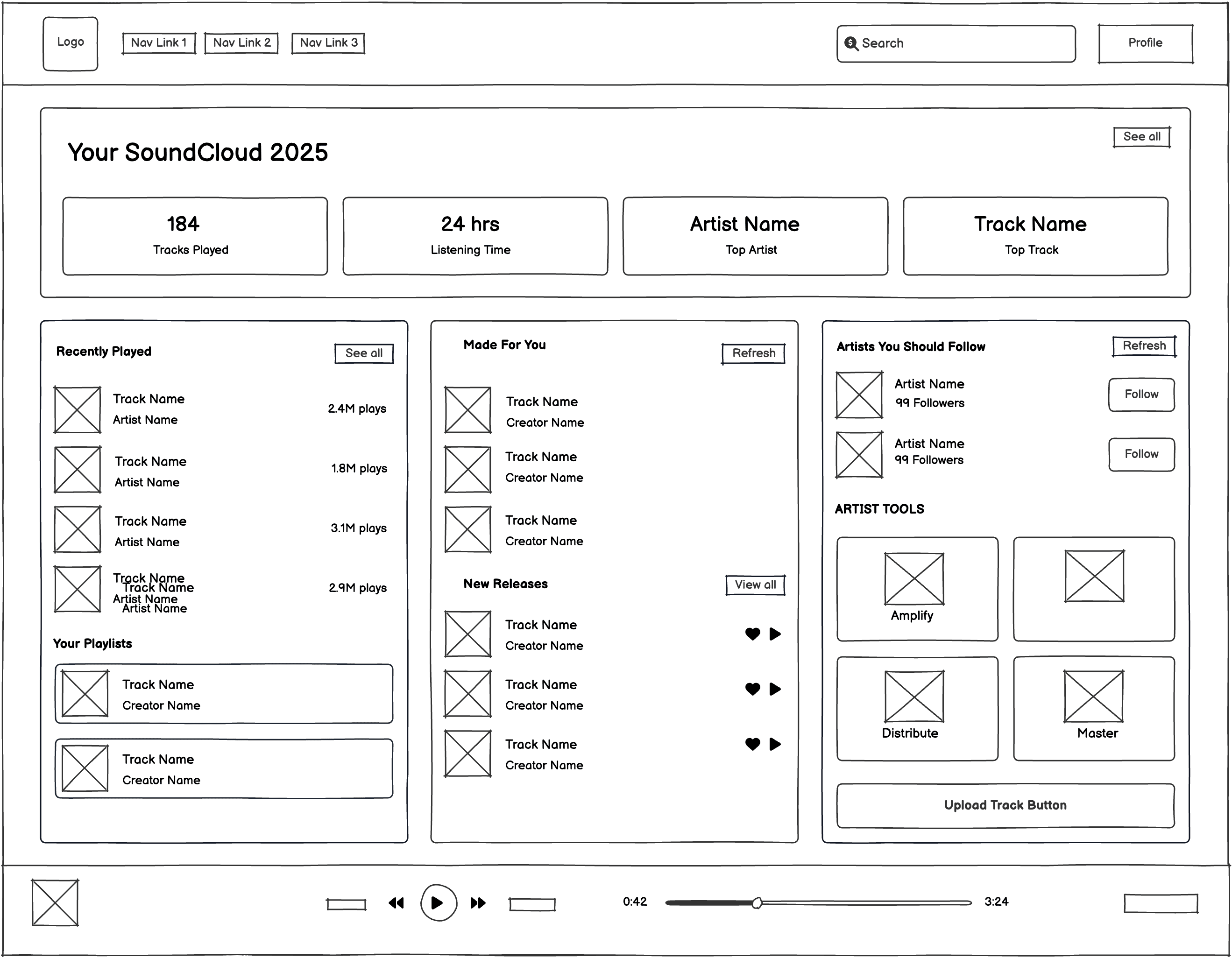
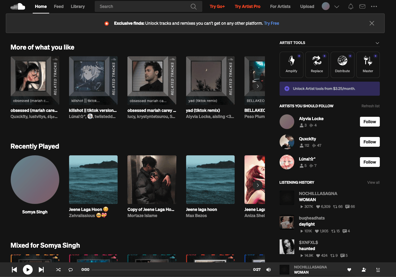
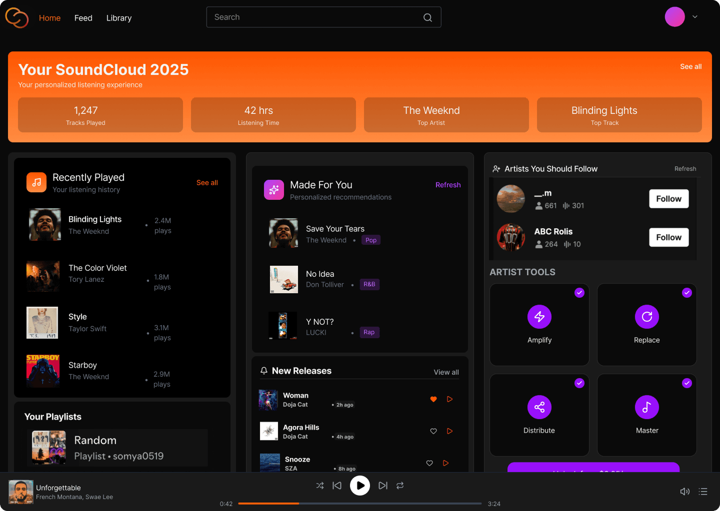
Home Page
Upload Page
Reworked the homepage with clearer navigation (text-based tabs and a visible Upgrade CTA), stronger visual hierarchy through spaced section headers, and a dedicated Artist Tools module to surface key creator actions. Introduced a hero stats panel and a cleaner grid layout to reduce clutter and improve scanability, applying usability principles like hierarchy and recognition over recall to make core actions and personalized data immediately visible and intuitive.
Redesigned the upload experience by splitting the interface into a clear two-panel layout for file uploads and audio recording, reducing cognitive load and supporting parallel workflows. Simplified dense text into scannable visual badges with progressive disclosure, added in-app recording options, and replaced text-only storage info with a visual usage dashboard. Applied usability principles through prominent, easy-to-target primary actions, consistent SoundCloud design patterns, and clear system status feedback to make the flow faster, clearer, and more intuitive.
Upload Page
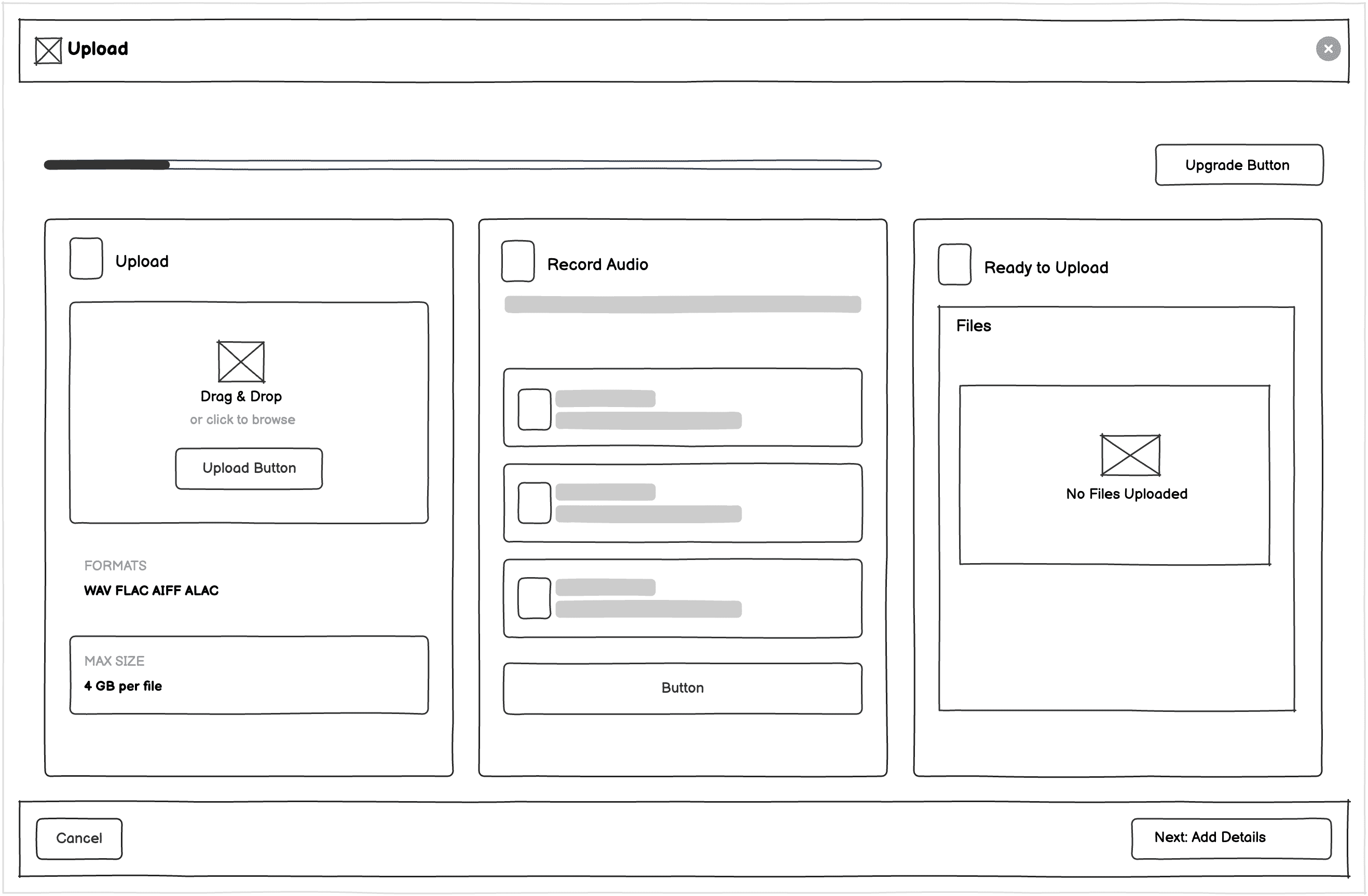
Low-Fidelity
Improved visual layout for the user to navigate easily.
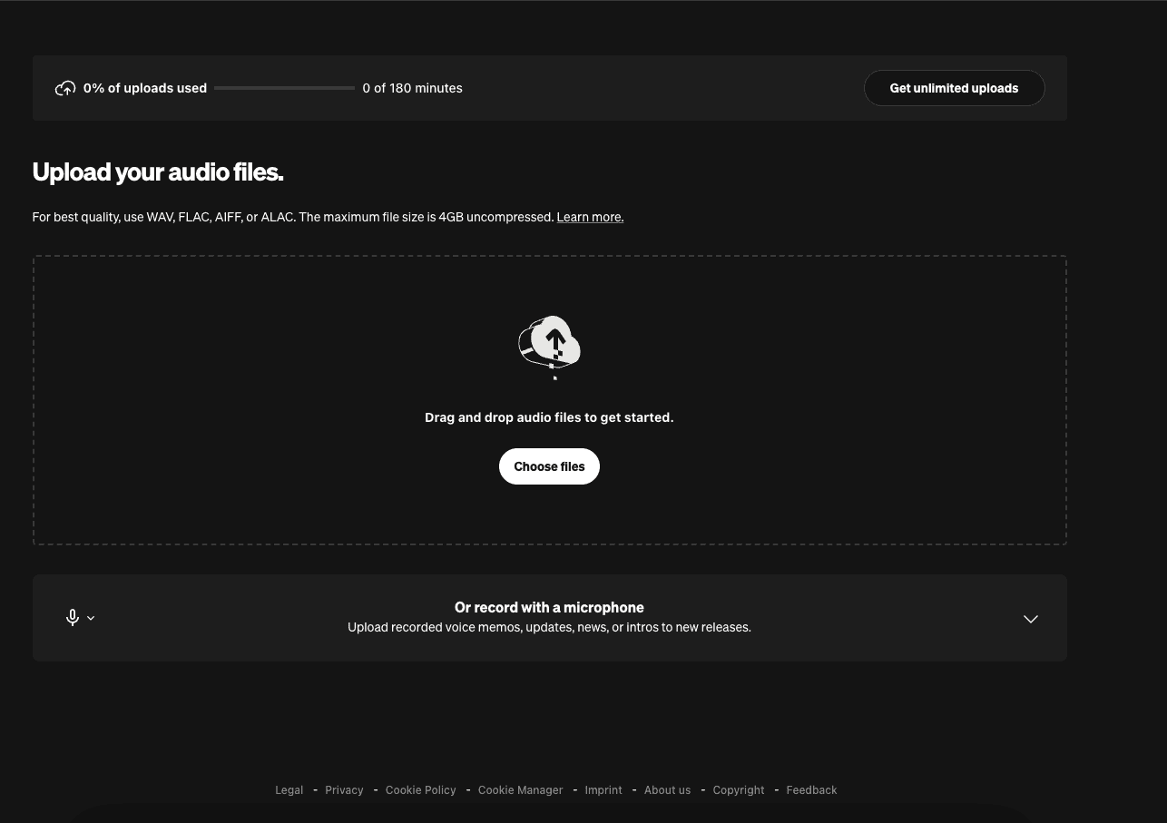
Upload Page
BEfore
Bland and lacking visual cues and user encouragement.
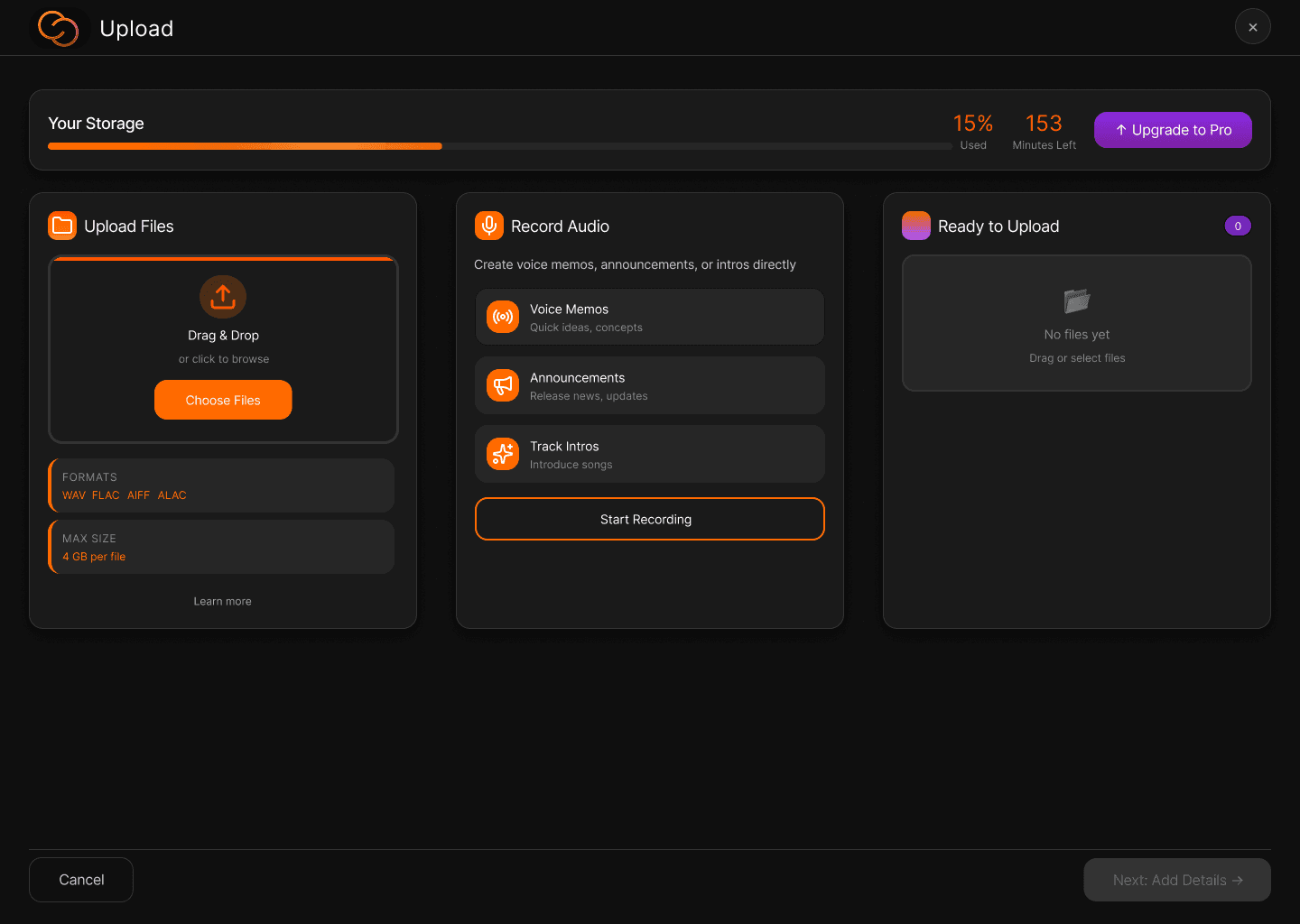
Upload Page
After
Intuitive, well-structured upload flow with guided upload and recording paths.
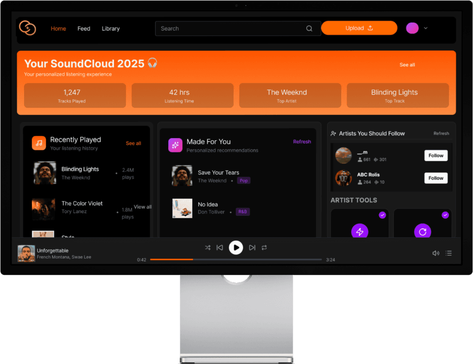
Home Page
Reworked the homepage with clearer navigation (text-based tabs and a visible Upgrade CTA), stronger visual hierarchy through spaced section headers, and a dedicated Artist Tools module to surface key creator actions. Introduced a hero stats panel and a cleaner grid layout to reduce clutter and improve scanability, applying usability principles like hierarchy and recognition over recall to make core actions and personalized data immediately visible and intuitive.
Home Page
Low-Fidelity
Organized layout with more refined grid system for core components.
Home Page
BEfore
Cluttered and disorganized home page with low visual guidance.
Home Page
After
Organized content for easy navigation with visual cues to highlight important sections.
Home Page: BEfore
Cluttered and disorganized home page with low visual guidance.
Home Page: Low-Fidelity
Organized layout with more refined grid system for core components.
Home Page: After
Organized content for easy navigation with visual cues to highlight important sections.
Home Page: BEfore
Cluttered and disorganized home page with low visual guidance.
Home Page: Low-Fidelity
Organized layout with more refined grid system for core components.
Home Page: After
Organized content for easy navigation with visual cues to highlight important sections.
Home Page: BEfore
Cluttered and disorganized home page with low visual guidance.
Home Page: Low-Fidelity
Organized layout with more refined grid system for core components.
Home Page: After
Organized content for easy navigation with visual cues to highlight important sections.
Home Page: BEfore
Cluttered and disorganized home page with low visual guidance.
Home Page: Low-Fidelity
Organized layout with more refined grid system for core components.
Home Page: After
Organized content for easy navigation with visual cues to highlight important sections.
Upload Page
Redesigned the upload experience by splitting the interface into a clear two-panel layout for file uploads and audio recording, reducing cognitive load and supporting parallel workflows. Simplified dense text into scannable visual badges with progressive disclosure, added in-app recording options, and replaced text-only storage info with a visual usage dashboard. Applied usability principles through prominent, easy-to-target primary actions, consistent SoundCloud design patterns, and clear system status feedback to make the flow faster, clearer, and more intuitive.
Upload Page: BEfore
Bland and lacking visual cues and user encouragement.
Upload Page: Low-Fidelity
Improved visual layout for the user to navigate easily.
Upload Page: After
Intuitive, well-structured upload flow with guided upload and recording paths.
Upload Page: BEfore
Bland and lacking visual cues and user encouragement.
Upload Page: Low-Fidelity
Improved visual layout for the user to navigate easily.
Upload Page: After
Intuitive, well-structured upload flow with guided upload and recording paths.
Upload Page: BEfore
Bland and lacking visual cues and user encouragement.
Upload Page: Low-Fidelity
Improved visual layout for the user to navigate easily.
Upload Page: After
Intuitive, well-structured upload flow with guided upload and recording paths.
Upload Page: BEfore
Bland and lacking visual cues and user encouragement.
Upload Page: Low-Fidelity
Improved visual layout for the user to navigate easily.
Upload Page: After
Intuitive, well-structured upload flow with guided upload and recording paths.
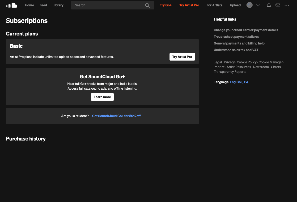
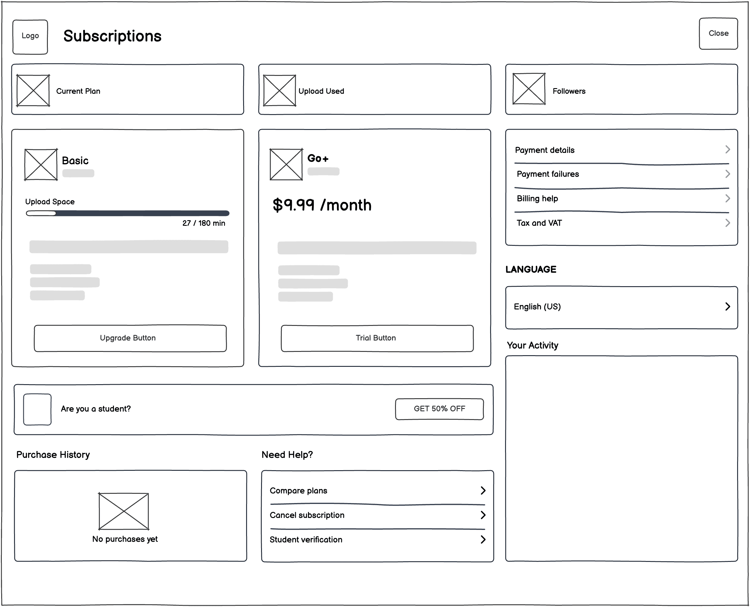
Subscription Page
Improved the subscription page by introducing clear section hierarchy and spacing, adding personalized usage and plan status data for immediate context, and reorganizing links into clearly defined groups for easier navigation. Applied visibility of system status and progressive disclosure principles to surface key information upfront while keeping secondary details accessible, resulting in a cleaner, more scannable, and user-centered experience.
Subscription Screen: BEfore
Unclear and unfocused subscriptions page that lacks plan details and intuitive navigation.
Subscription Screen: Low-Fidelity
Organized user flow with more details and proper navigation.
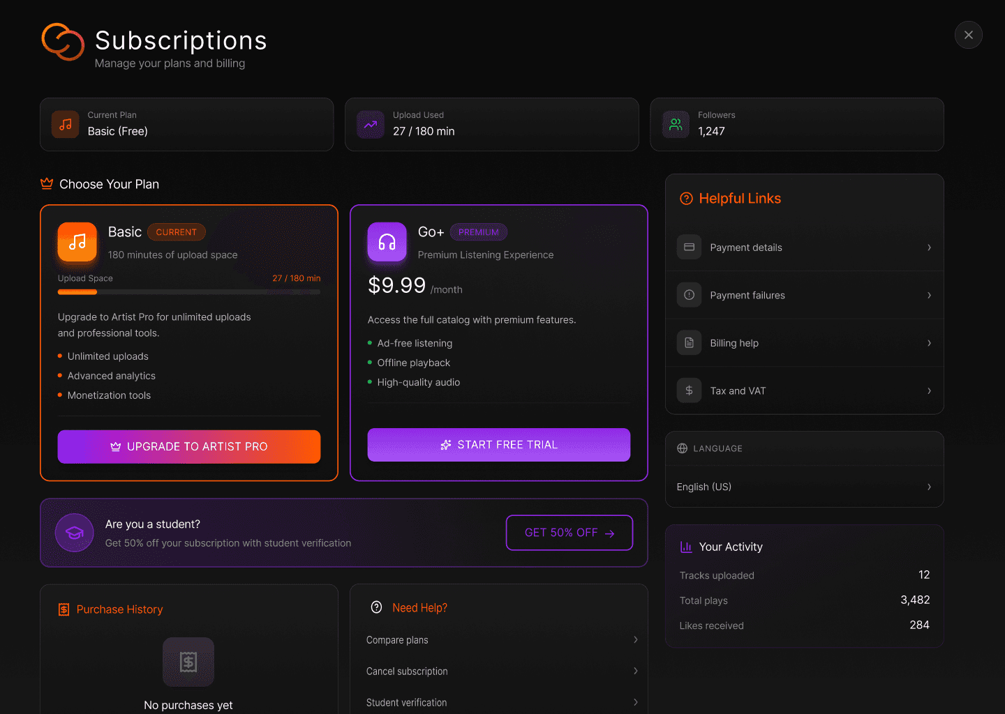
Subscription Screen: After
Structured subscriptions page that clearly presents plans, usage, and benefits with intuitive navigation.
Subscription Screen: BEfore
Unclear and unfocused subscriptions page that lacks plan details and intuitive navigation.
Subscription Screen: Low-Fidelity
Organized user flow with more details and proper navigation.
Subscription Screen: After
Structured subscriptions page that clearly presents plans, usage, and benefits with intuitive navigation.
Subscription Page
Improved the subscription page by introducing clear section hierarchy and spacing, adding personalized usage and plan status data for immediate context, and reorganizing links into clearly defined groups for easier navigation. Applied visibility of system status and progressive disclosure principles to surface key information upfront while keeping secondary details accessible, resulting in a cleaner, more scannable, and user-centered experience.
Subscription Page Low-Fidelity
Organized user flow with more details and proper navigation.
Subscription Page BEfore
Unclear and unfocused subscriptions page that lacks plan details and intuitive navigation.
Subscription Page After
Structured subscriptions page that clearly presents plans, usage, and benefits with intuitive navigation.
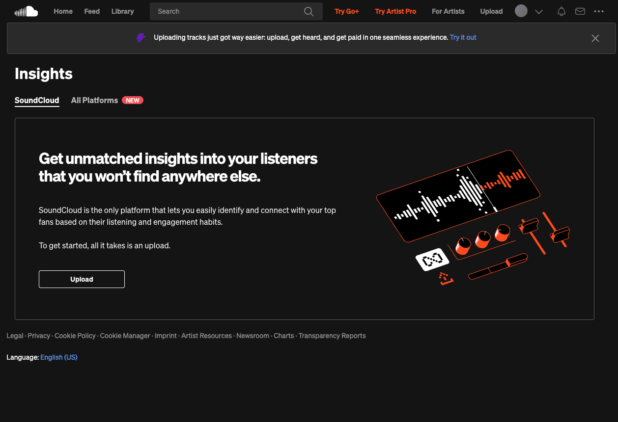
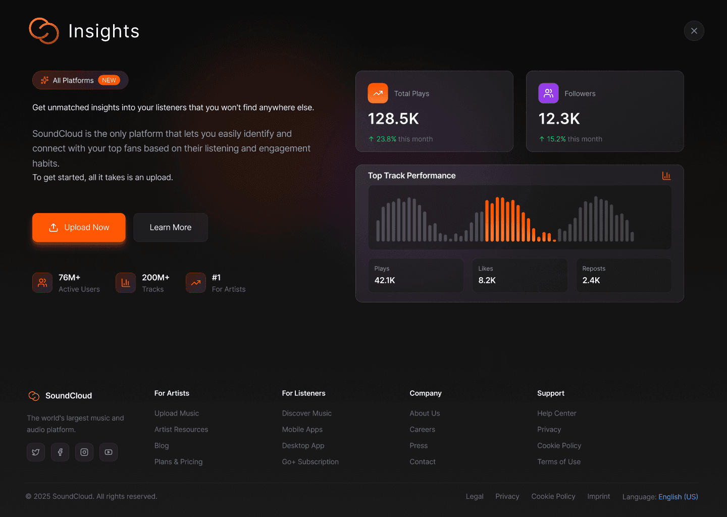
Insights Page
Converted a text-heavy page into a scannable user friendly page, adding platform-scale social proof, and restructuring the layout to guide users from value proposition to action. Applied progressive disclosure and recognition-over-recall principles to present information in clear layers, making the elements tangible, scannable, and immediately actionable.
Insights PAge
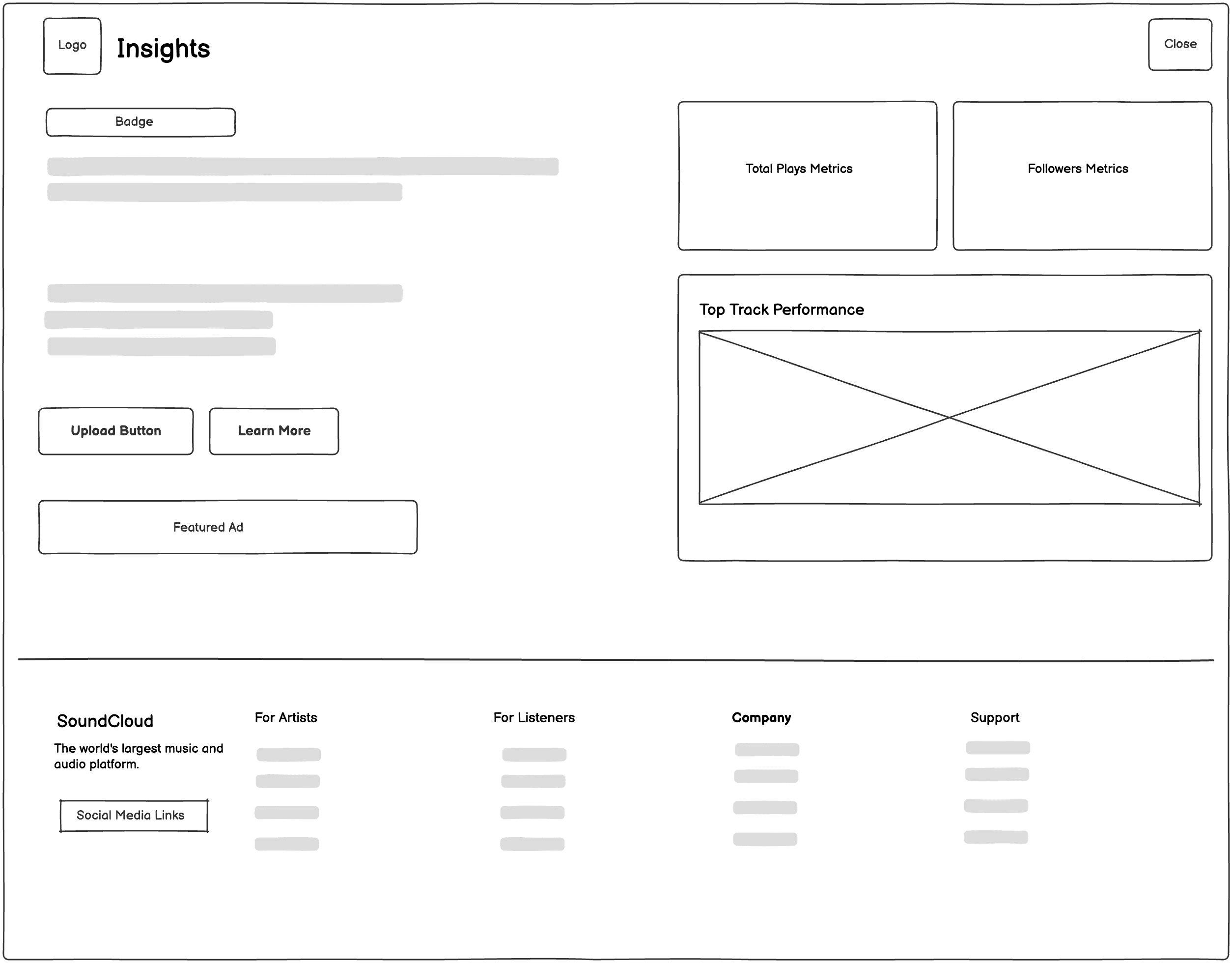
Low-Fidelity
Updated visual hierarchy for artists to get proper information about insights.
Insights Page
BEfore
Poor visual hierarchy and no clear value proposition before the call-to-action.
Insights Page
After
Clear value messaging and strong social proof.
Insights Page
Converted a text-heavy page into a scannable user friendly page, adding platform-scale social proof, and restructuring the layout to guide users from value proposition to action. Applied progressive disclosure and recognition-over-recall principles to present information in clear layers, making the elements tangible, scannable, and immediately actionable.
Insights Page: BEfore
Poor visual hierarchy and no clear value proposition before the call-to-action.
Insights Page: Low-Fidelity
Updated visual hierarchy for artists to get proper information about insights.
Insights Page: After
Clear value messaging and strong social proof.
Insights Page: BEfore
Poor visual hierarchy and no clear value proposition before the call-to-action.
Insights Page: Low-Fidelity
Updated visual hierarchy for artists to get proper information about insights.
Insights Page: After
Clear value messaging and strong social proof.
Insights Page: BEfore
Poor visual hierarchy and no clear value proposition before the call-to-action.
Insights Page: Low-Fidelity
Updated visual hierarchy for artists to get proper information about insights.
Insights Page: After
Clear value messaging and strong social proof.
Insights Page: BEfore
Poor visual hierarchy and no clear value proposition before the call-to-action.
Insights Page: Low-Fidelity
Updated visual hierarchy for artists to get proper information about insights.
Insights Page: After
Clear value messaging and strong social proof.
Typography & Color Pallete
Typography & Color Pallete
Typography
Display / 56px
Medium
Aa Bb Cc
Heading 1 / 48px
Medium
Aa Bb Cc
Heading 2 / 36px
Medium
Aa Bb Cc
Heading 3 / 24px
Medium
Aa Bb Cc
Heading 4 / 20px
Medium
Aa Bb Cc
Body Large / 18px
Regular
Aa Bb Cc
Body / 16px
Regular
Aa Bb Cc
Small / 14px
Regular
Aa Bb Cc
Inter · Sentence-case microcopy
Color Pallete
#FF7214
Tangerine
#7214FF
Electric Purple
#FF142B
Fire Red
#141414
Jet Black
Color Pallete
Jet Black
#7214FF
Electric Purple
#FF142B
Fire Red
#FF7214
Tangerines
Typography
Medium
Display / 56px
Aa Bb Cc
Heading 1 / 48px
Aa Bb Cc
Medium
Heading 2 / 36px
Aa Bb Cc
Medium
Heading 3 / 24px
Aa Bb Cc
Medium
Heading 4 / 20px
Aa Bb Cc
Medium
Body Large / 18px
Aa Bb Cc
Regular
Body / 16px
Aa Bb Cc
Regular
Small / 14px
Aa Bb Cc
Regular
Inter · Sentence-case microcopy
High-quality, synchronized captions & transcripts
High-contrast mode and scalable UI
Clear, consistent interface with simple language
Accessibility & Inclusion
Key Learnings
Guide, don't control
Accessibility is essential
Simplicity builds confidence
Inclusion is multifaceted
01
02
03
04
05
Map the core listening journey
Build a focused, accessible prototype
Test with diverse users
Finalize and prioritize the MVP feature list
Define success metrics for launch
Next Steps
Conclusion
This project has identified a core user who needs gentle, real-time guidance to feel confident. To serve them best, we will build an intrinsically accessible and simple audio platform that empowers through flexibility, not control. The next phase will transform these insights into a tangible prototype, tested and refined with our diverse community at the center.
This project has identified a core user who needs gentle, real-time guidance to feel confident. To serve them best, we will build an intrinsically accessible and simple audio platform that empowers through flexibility, not control. The next phase will transform these insights into a tangible prototype, tested and refined with our diverse community at the center.
Conclusion
Map the core listening journey
Build a focused, accessible prototype
Test with diverse users
Finalize and prioritize the MVP feature list
Define success metrics for launch
Next Steps
Key Learnings
Guide, don't control
Accessibility is essential
Simplicity builds confidence
Inclusion is multifaceted
High-quality, synchronized captions & transcripts
High-contrast mode and scalable UI
Clear, consistent interface with simple language
Accessibility & Inclusion
Research & Insights
Research Methods
SWOT Analysis
Competitive Analysis (Spotify, Apple Music, Bandcamp)
User Persona Development
Task Analysis, User Flow Mapping, and Heuristic Evaluation
Key Insights
Dense layouts and weak hierarchy make discovery harder for both listeners and creators.
Discovery is visually overwhelming
Accessibility gaps limit creator participation
Small, well-timed interruptions reduce impulsive behavior.
Visual inconsistency increases cognitive load and slows decision-making.
The interface is difficult to scan quickly
Navigation and creator tools lack clarity
Confusing labels and hidden CTAs make it hard for users to find the right content or manage creator features.